WWW.JACKBALAS.COM
| HOME |
|
PHOTO |
|
RESUME | TOUR & STATEMENT | PUBLICATIONS & CONTACT |
Artist Blog |
|
SHELF LIFE:
A CONTEMPLATION ON SEEING ONE'S
ARTWORK IN AN ART MAGAZINE AD
December 4, 2015
Living out West in what many folks in the art world consider "fly-over" territory, I spend a fair amount of time looking through the monthly art magazines to maintain some sense of what's going on and what's being shown in the galleries and museums in large art-cities such as New York, Los Angeles, London, and Berlin. While there's even so much more to be found online these days, I do enjoy the 'zines as physical objects, compendiums of paper that have a beginning and an end, an arguable structure content-wise, a progression and a passivity that (usually) does not pop up at me, flash things in the margins, ring bells and blow whistles to gain my already-fractured attention. They each have their editorial differences among themselves, their concerns and self-presentations that vary from one to another, their level of seriousness, even, from erudite to neophyte. What they all share, though, is advertising, the paid-for spots of self-promotion taken out by galleries, for the most part, as well as institutions and the occasional independent artist- group shows in print, though uncurated and open to those with enough cash to plunk down.
Having perused such arrays for years, perhaps it was inevitable that I, as an artist, began to daydream what my own work would look like in the pages. Definitely with a "why not?" attitude, in 1999 I began a series of collages called NAME MATTERS, ads literally torn out of these magazines into which I then pasted my own name, the ads in question being shopping lists of artists' names presented by galleries who assumed that readers already were familiar with the type of work those individuals did- lists that simply announce "these are the folks we show" without providing images. Recent iterations of this series take similar lists and, blocking out some of the lettering presented, leave those letters among them that spell out my own name.
In 2006 I upped the ante, in conjunction with my own desire to see more images of men presented among the magazines' imagery, much of which seems to this day to focus heavily if not exclusively on the female, especially when it comes to the erotic (i.e. nekkid babes). Taking specific ads as inspiration, I began to paint watercolors that reproduced their graphic design verbatim, including layouts, gallery names, artist names, addresses, even titles of specific works, all the while inserting male imagery where before there was none. This MUSE/ MUSEUM series is ongoing, and has morphed from a critique of sorts to, in some cases, tributes to artists I've long admired and whose images I've carried around in my head for years. The series also began to target specific artworks from history, many of them from the Art Institute of Chicago, whose halls I wandered growing up in that city. I became quite interested as well in the curatorial texts found with many artworks in the form of the small and ubiquitous cardboard tags on the wall. Taking photos of said tags, I reproduced their look and language on a number of men's bodies as if they were tattooed onto their skin. In other cases I wrote fanciful texts of my own to appear next to the images, though the texts to be read in these cases are obvious fictions.
In all of this an interesting point to consider has been, when do these assorted fictions become reality? They are, of course, physical objects (paintings), but if they are reproduced in a magazine ad for my own work, or appear in a museum show, do these fictions take on an uber-level of reality in some way? A painting of my own dropped within the confines of a painted ad for the Museum of Modern Art- if the painting is then published or displayed (especially by MoMA), is it in fact a case of a wish come true?
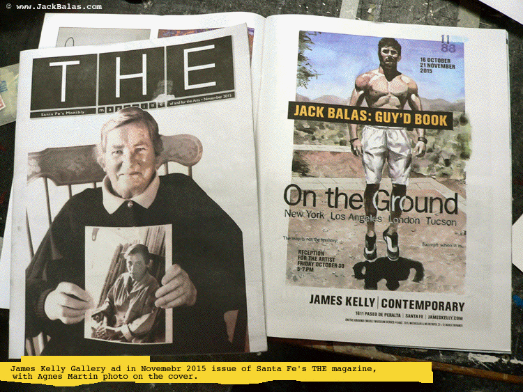
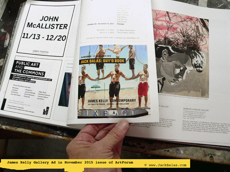
Lo and behold, in the November 2015 issue of ArtForum, a quarter-page ad with one of my images has appeared, for a solo show at James Kelly Contemporary in Santa Fe, reproducing a detail from one of the MUSE pieces, namely an acrobatic pyramid-looking configuration of 6 beefy dudes at the beach (actually all the same guy), titled "BRUCE NAUMAN: SIXPACT." While it is a definite pleasure to see the image reproduced, and while it is my work's first appearance in a national/ international publication (following a solo ad in a regional magazine in 2010, and a collaborative image in an Art In America ad even further back), what strikes me most this time around is the context in which this image appears.
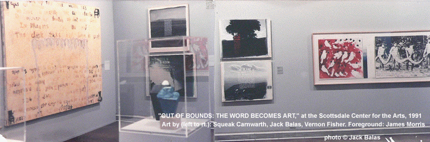
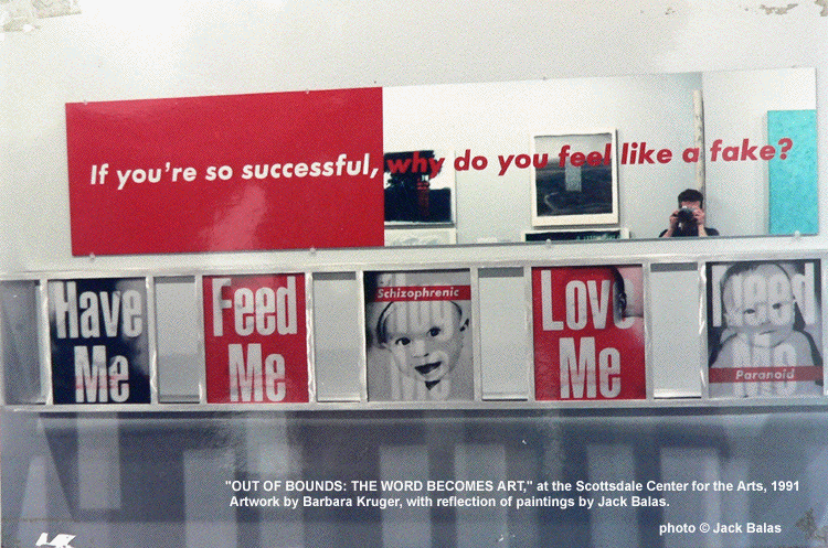
My first remarkable experience of this heightened sensation came with a group show in 1991 called "OUT OF BOUNDS: THE WORD BECOMES ART," at the Scottsdale Center for the Arts in Arizona. I drove down for the opening, and was captivated to see my work on the wall right next to that of Vernon Fisher on one side and Squeak Carnwath on the other, and across the room from a Barbara Kruger piece whose partial-mirrored surface allowed me to see my own paintings behind me. The phrase often used in a situation like this is that the works "are in conversation" with each other, but what becomes more important is the conversation going on in my head with these other artists - a conversation that ups the ante for the quality of one's own work, and asking questions like: is the work relevant? does it have not only something to say, but also something to add?
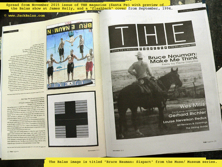
Thus, this time around in the curated-only-by-cash "exhibition" among the pages of ArtForum, I was equally captivated to find my image among other quarter-page ads for White Columns and the MIT List Center, an image of a David Salle print in the next spread, and a few pages back a photo of H.C. Westermann sitting on the bumper of his "Bat Mobile," Westermann who, in his military days, was an acrobat--- not unlike the image I've concocted in my painting called "Bruce Nauman: Sixpact." To extend the idea of context to Nauman himself, the Santa Fe arts monthly THE magazine, which had run a couple of full-page ads for the show at James Kelly, also did, in their November issue, a paragraph "preview" of the show that reproduces this acrobatic image (inspired, or course, by Nauman's "Animal Pyramid" to be found on the back lawn of the Des Moines Art Center in Iowa) across the spread from their own September, 1994, cover (a feature titled "Flashback) that displays Nauman himself on a horse, along with the text "Bruce Nauman: Make Me Think."
This swirl of thoughts and images and influence definitely makes me think, including those about the procession of images within the confines of the magazine. At 333 pages total, the November 2015 ArtForum has 228 pages of advertising, 218 of those being full-page ads (or even double-page) at $6000-8000 per page (the higher price for those ads appearing in the first 20% of the magazine). The remaining 105 pages could be considered "editorial" content, including 48 pages of articles, and 36 pages of exhibition reviews. It surprised me that there were only 4 pages of quarter-page ads among all of this, definitely the least expensive, but it surprised me more that they would appear about half-way through the progression of pages. Money certainly talks in an environment such as this, but it's really the context that, to me, has the most to say. How does my work look? I ask myself. And how might it look even better the next time around, if ever that may be? While group shows come with an occasional catalog you can look back at in the years to come, here is a different sort of group show, taking its place on your library shelf every month after its arrival in a mailbox near you.
Jack Balas
xxx